How to Use Etruscan Red for a Warm, Welcoming Home
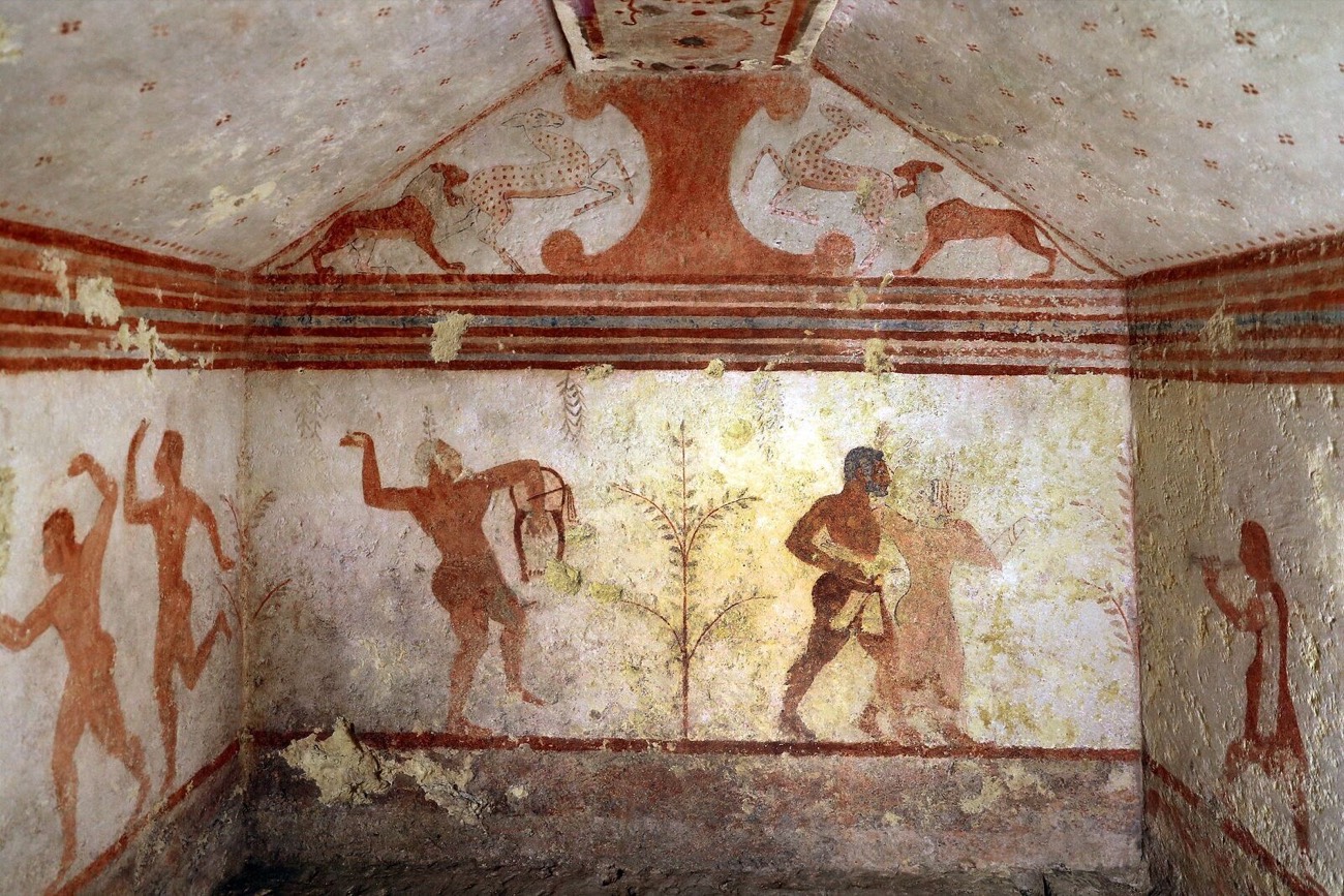
For a home that feels warm and welcoming, color expert Joa Studholme recommends Farrow & Ball’s Etruscan Red.
With its rich, earthy character, this shade remains one of her favorites.
Here, she shares how she pairs Etruscan Red with other colors to bring depth to bedrooms and a friendly, family feel to kitchens.
- 4. Ground the Kitchen With a Brown
1. Embrace Its Earthy Richness
Etruscan Red takes its inspiration from the elaborately painted tombs and terracotta sculpture of the ancient Etruscans.
Studholme describes Farrow & Ball's Etruscan Red as a little more toasted and tempered with richness and an unexpected sense of opulence.
For those drawn to warm, earthy interiors, the shade offers a way to celebrate earth pigments at home.
Its historical inspiration also connects with Farrow & Ball’s original commitment to quality ingredients and traditional techniques.
2. Pair It With Picture Gallery Red
Etruscan Red was the color Farrow & Ball used on their original tin.
Studholme also quips that, although less noteworthy, it was the first Farrow & Ball color she used in her own home.
She chose it for a spare bedroom, pairing it with the slightly lighter Picture Gallery Red, which is a combination she still favors 35 years later.
Using the two shades together offers a way to introduce variation while keeping the room within a warm red palette.
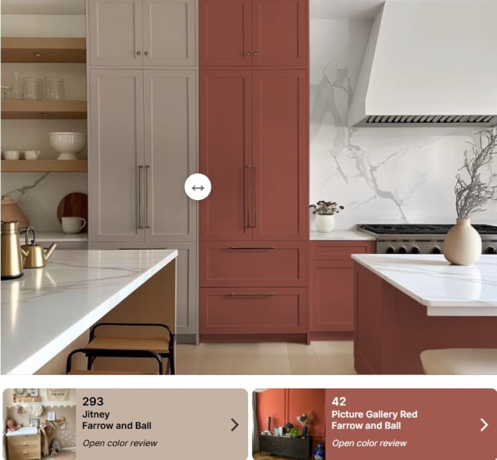
3. Bring Warmth to Kitchen Cabinets
According to Studholme, Etruscan Red has become increasingly popular for kitchen cabinets because it creates a friendly, family feel.
Her suggested combination is Etruscan Red cabinetry with Jitney on the walls. She describes Jitney as quite strong but warm, making it a companion for the rich red cabinets.
4. Ground the Kitchen With a Brown Island
To add depth to that kitchen scheme, Studholme suggests painting the island Tanner’s Brown.
The darker color gives the room more presence and helps ground its center.
5. Layer Related Colors Within One Room
Studholme also describes a recent scheme that used a gradient of colors, including Etruscan Red, Picture Gallery Red, and Marmelo within a single room.
The idea is to build a palette from related shades. Her examples show how variations in warmth and depth can give a room a richer, more layered appearance.
Final Thoughts
For Studholme, Etruscan Red remains a favorite because of its warmth, richness, and earthy character.
Whether used in a spare bedroom or on kitchen cabinets, her advice is to pair it thoughtfully with colors that support that warmth.
Have a question about this story? Write to us — we answer every message.
 Inside a Tiny House That Feels Bigger Than Its 10 Square Meters
 How to Turn an IKEA KALLAX Into a Woven-Door Cabinet
 Three Taper Candle Tricks for Stress-Free Hosting